|
Choice and Accountability
Posted on Wednesday, December 11, 2013 |
0 Comments
A few days ago I posted the final version of this piece on instagram and my facebook page, and so I wanted to show you guys how I went about putting this piece together. As this is another image in my Value series, I asked another girl from church if she would be willing to model for me. Coincidentally, she knew the location of a "crossroads", which was what I had been wanting for this photo, and so after taking some portraits at the Spofforth Castle ruins (which was close by) just for fun, we made our way over to this walking path near her house. She probably thought I was crazy when I said the location was perfect, despite the green, metal car barriers and the quite un-picteresque sign:

It probably didn't help that I asked her to turn away from the camera for this photo, haha. But she did fabulously and I got exactly what I had wanted, so it all worked out I think. :)
Anyway, as for the process, I actually had to do an expansion for this one, as I was working with my 35mm (which in my opinion has quite a narrow angle of view, although not as bad as the 50mm) and as it was, I was backed up against a thorn bush just to get the above image. So with the focus set, I snapped a few of her, and then of her surroundings so that I could get the path going off into the distance in both directions.
  
I ultimately ended up using five photos for the expansion, her being in
the center, and then four around her to get what you see below:

So then the next thing to do was to get rid of the barriers:

And the ugly sign. Behind me was actually a cool wooden sign, but it was only pointing in one direction, and obviously was in the wrong place for my photo. So I took a photo of it, duplicated the one side so I could switch it over to the other, and then pasted it into this image. Much more picturesque, in my opinion:

Then for the details: her hair had fallen down a bit in the back, and so I erased a bit of it so that it looked more like it was up in a loose bun instead of falling out. Imagine that? Her hair falling out after climbing through fields and over ruins... huh...

Of course, the color for Choice and Accountability is orange, and so I changed the color of her dress to sort of tie it back into the Value itself:

But that orange looked terrible with her skin and was sort of an eye sore, so I muted the color down a bit. Just a suggestion of orange:

Then I started playing around with the two different directions of the path. Since Choice and Accountability is all about choosing between right and wrong and being accountable for those choices, I wanted to show one path as being dark and dreary, and one as bright and well... cheery! So I experimented with different things, like using the burn tool to make it darker, bringing the exposure down, adding filters. The first one I tried was to use the dodge tool and lower the exposure a bit, but I wasn't entirely happy with it. As you can see, it's just too dark and you loose all the detail. It also means that there's more of a line between the light and the dark, and I didn't want that. I wanted it to be a really gradual thing. In life we don't just all of a sudden become bad, or good. It's a process we go through of making one choice after another. So less dark, more gradual, which isn't what I was getting in the image below:

So then I thought, well darkness and evil is generally associated with the color green, so I tried a green filter, but I didn't really like that either:

Getting a bit frustrated, I took out the filter and what I had done with the burn tool and just masked in a layer with a lower exposure in that area. Better, but still not perfect.
Also, after some editing, I felt like her dress was getting lost in it all, and so I brought up the saturation a bit more so she stood out a little bit better. I also masked in a layer of higher exposure on the other path as a bit of a contrast to its darker counterpart. Getting closer, but not quite there!

Here's me messing around with the brighter side, trying to make it look a bit more inviting without the grass in the distance looking neon (as it did in the photo above):

Now, this whole time I still felt like my model wasn't jumping out at the audience and grabbing their attention, which really prevented me from being able to focus on anything else. Once again I tried making it redder, greener, making her brighter, anything to get her to stand out. After several hours of despairing and trying to work on other parts of the image without success, I realized I hadn't been thinking as the artist my grandmother taught me to be; in other words, thinking in terms of my paint palette! When I realized this the solution immediately came to me and solved my problem! If the model was in an orange dress, and I wanted her to stand out, I needed to make the background contrast with her in some way. So on the color wheel standing opposite orange is purple. Feeling kind of dumb because it had taken me so long to think of that, I masked in a purple filter on the background. Once I did so I thanked my amazing grandma (Thank you grandma for teaching me everything there is to know about painting! You're amazing!), and appreciated the much improved photograph. With that issue finally out of the way, I could focus once again on the two branches of the path and making them contrast as much as possible, while still looking believable (in a fairy tale sort of way, if that makes any sense, haha). I still wasn't feeling like the two branches looked like they were conveying the feeling I wanted them to give off.
Now I am a lover of color. It is hard for me to convert any of my images into black and white because I love the color so much (not that I don't appreciate black and white images! I love them! Just generally not on my images). So I thought, what would a dreary world with no hope look like to me, and figured it probably would be colorless and cold. So I gave a layer of semi-desaturation a go and immediately loved it:

But the "bright, happy side" still wasn't working for me. So I tried making it bluer, making it more yellow, taking the contrast down, and once again everything I tried wasn't working.
 
So as my last dich effort, I decided to paint over the area with yellow on a super low opacity so that it was almost like a haze. And voila! The piece was done!

I will admit that I had my doubts about how much I would like this piece at first. But I wanted to have a photo for each of the eight values, and so I worked on it anyway. Even though this took me several days of trying this and that, walking away from it, coming back to it, etc., I love the end result! In all seriousness, the more I look at it, the more I love it. And I think that's how it should be.
Labels: Art, Behind the Scenes, Church, England, Photography, United Kingdom The McKeown Family
Posted on Tuesday, December 3, 2013 |
0 Comments
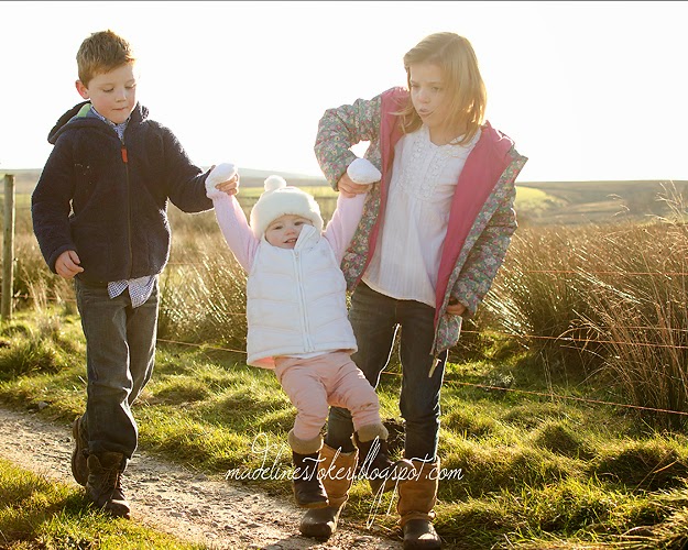
When I have the opportunity to take photos of families like this, it seriously makes my desire to become a professional photographer increase about ten fold. This session was so much fun, even if it ended with a mud fight and buckets of water being thrown. To be honest, though, I think that just added to the fun!
Shortly after my family moved to England, my mom met the McKeowns at church and became good friends with them. And I'm so glad she did! This is one amazing family, living in one amazing place! Just see for yourself:
                        Labels: Family Photographer, Photography, United Kingdom |
About
Arkansas native.
Currently based in Boston. Travelling soul. "Unexpected travel suggestions are dancing lessons from God." - Kurt Vonnegut Jr. Contact
madeline.s.stoker@gmail.com
Archives
July 2011 August 2011 September 2011 October 2011 November 2011 December 2011 January 2012 February 2012 March 2012 April 2012 May 2012 June 2012 July 2012 August 2012 September 2012 November 2012 December 2012 January 2013 March 2013 April 2013 May 2013 June 2013 July 2013 August 2013 November 2013 December 2013 August 2014 October 2014 November 2014 December 2014 January 2015 February 2015 March 2015 April 2015 June 2015 July 2015 August 2015 September 2015 October 2015 November 2015 December 2015 January 2016 February 2016 Labels
Animals,
Arkansas,
Art,
Au Pair,
Behind the Scenes,
Church,
Conceptual Work,
Czech Republic,
Engagements,
England,
Family,
Food,
France,
Germany,
History,
Holiday,
Humor,
Italy,
Knitting,
Life,
Motivational,
Music,
Nature,
Photo Challenge,
Photography,
Politics,
Prague,
Quotes,
School, Spain,
Study Abroad,
Travel
United Kingdom
|